



to tell you a better story.
I prefer you visit my site on
the desktop.
Designing a product's identity from its logo
Usually the logo comes out of the brand. You agree on the idea, the colours and the tone, then draw a mark that carries them. X Tracker went the other way round. The logo came first, a bold, flat, black-outlined 3D X on yellow, and the rest of the identity was taken from it.
X Tracker is time tracking for hourly contracts that both sides can trust. It logs work in 10-minute blocks, and tracking only unlocks after both sides approve the contract. A product like that needs to feel honest and simple, and a loud yellow X is a good place to start.
The logo: a 3D X in teal and orange above the wordmark, on yellow.
Take the palette from the mark
The logo already holds four colours: a yellow ground, teal and orange faces, and black outlines. Rather than invent a palette, I gave each of them a job.
- Yellow is the only action colour: primary buttons, links and the focus ring. Text on yellow is always black.
- Teal means tracked time, and marks "active" and "on" badges.
- Orange means manual time.
- Black is the page background, and the text on yellow.
Two more colours fill the gaps: off-white for text on dark, and red, which is kept for destructive actions and errors only.
The important word in all of this is "only". If yellow is the only action colour, a person can find the next step on any screen without reading it. If teal and orange are reserved for data, the work diary reads at a glance: you can see how much of a day was tracked and how much was added by hand before you read a single number.
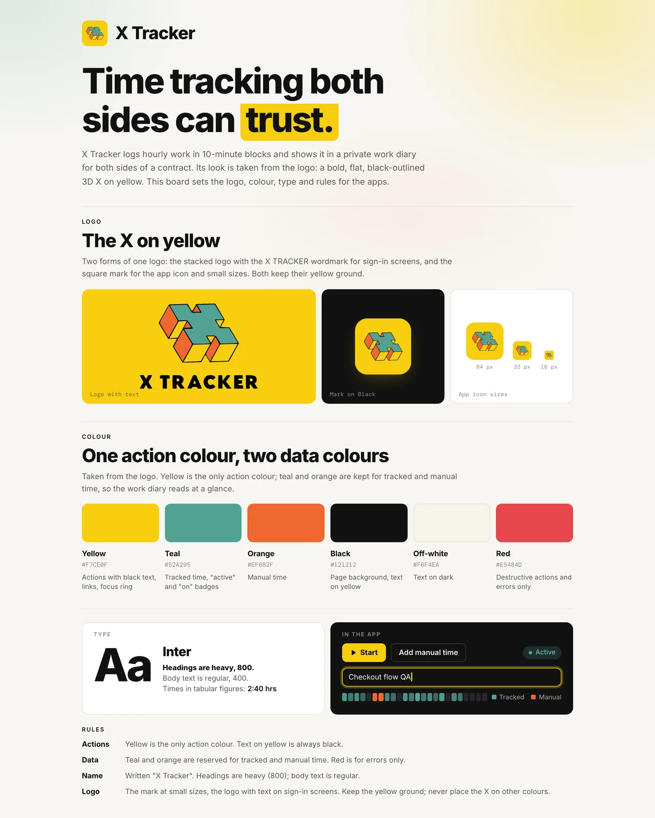
The brand board: the X on yellow, six colours with their roles, Inter type and the rules.
Type that stays out of the way
The type is Inter throughout. Headings are heavy, at 800, and body text is regular. Times are set in tabular figures, so a running clock does not shuffle sideways as the digits change. A heavy heading beside a heavy mark keeps the app feeling like its logo without decorating every screen.
Rules that protect the mark
A distinctive logo is easy to wear out, so the rules are short:
- Use the square mark at small sizes and the logo with text on sign-in screens.
- Keep the yellow ground. Never place the X on other colours.
- Write the name as X Tracker.
The yellow ground is the rule most likely to be tested, because a dark app is full of places where a bare X would be tempting. Keeping the yellow tile everywhere is what makes a small app recognisable in a dock or a menu bar.
The colours are not only on the board. They live as tokens in the stylesheets of the web app and the desktop app, so the rules above are the same rules the code follows.
The identity in the product
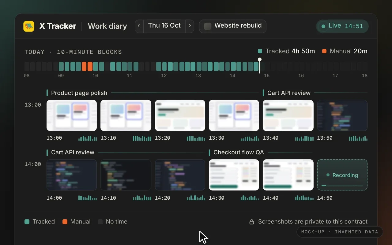
Mock-up with invented data: the web diary in 10-minute blocks, tracked time in teal and manual time in orange.
The work diary is where the data colours earn their place. Each 10-minute block is teal if it was tracked and orange if it was added by hand, so the shape of a day is visible before you read anything.
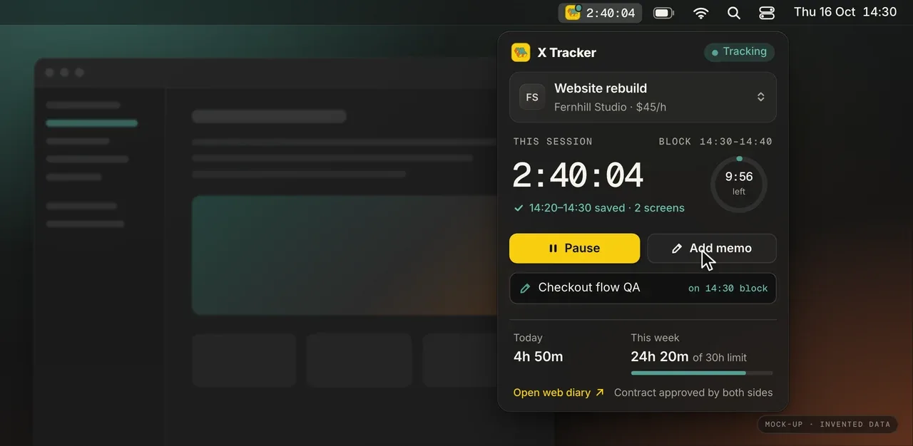
Mock-up with invented data: the menu-bar timer, where yellow marks the main action.
In the menu-bar timer, yellow marks the main action and nothing else. On the contract screen, both sides approve the same version of the terms, and only then does tracking unlock. That screen is the product's promise in one view, and it uses the same three ideas as everything else: black ground, teal for what is active, yellow for what to do next.
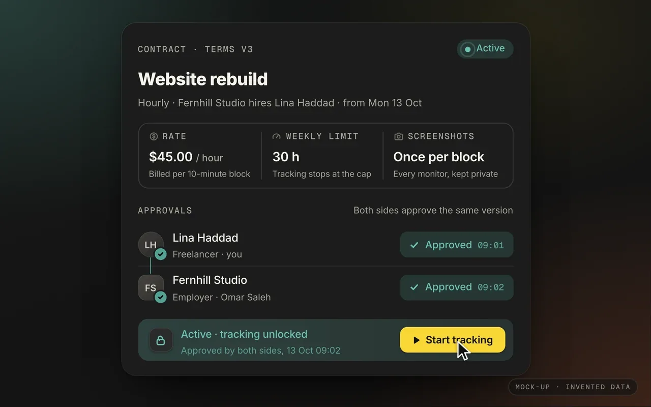
Mock-up with invented data: a contract approved by both sides, which unlocks tracking.
Why it works
Taking an identity from a logo is a shortcut, but a disciplined one. Every colour already belongs to the brand, so nothing feels bolted on. The trick is to stop the shortcut becoming a free-for-all: give each colour one job, write it down, and keep the rules few enough that everyone remembers them.
The app is private, so there is no public link, but the board and the product mock-ups are on the X Tracker page.
liked it? share it.

