



to tell you a better story.
I prefer you visit my site on
the desktop.
Lab meets luxury: a Didone identity for skincare
Cellular skincare can go wrong in two directions. Lean into the lab and it looks like a pharmacy shelf: cold, white and clinical. Lean into luxury and the science disappears behind gold and mood lighting. The brief for AUERA was to sit between the two: precise, but never cold.
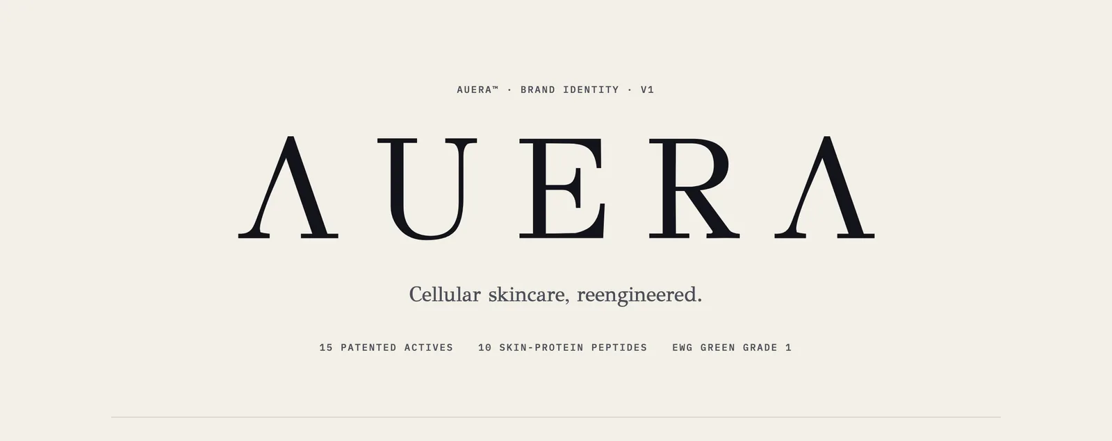
The identity board opens on the wordmark and one line.
Two arcs of light
The idea is in the letters. Both A's in AUERA drop their crossbars and become clean Λ peaks that bookend the name, like the edges of a glow. The board calls this the aura. It also gives the brand something every small brand needs: a mark you can recognise from its outline alone, before you can read it.
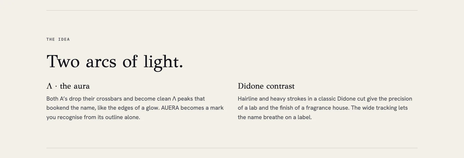
The idea: two Λ peaks and Didone contrast.
Why a Didone
A Didone sets hairline strokes beside heavy ones. That contrast does two jobs at once: it has the precision of a lab and the finish of a fragrance house. Set with wide tracking, the name breathes on a small label, which matters when the label is where most people will first meet it.
The supporting type is deliberately quiet. GFS Didot is for the name and the headlines, Hanken Grotesk carries the body copy and the science, and IBM Plex Mono sets the data. Each typeface has one job, so a product page can move from a headline to an ingredient to a number without changing its tone of voice.
A logo system, not a logo
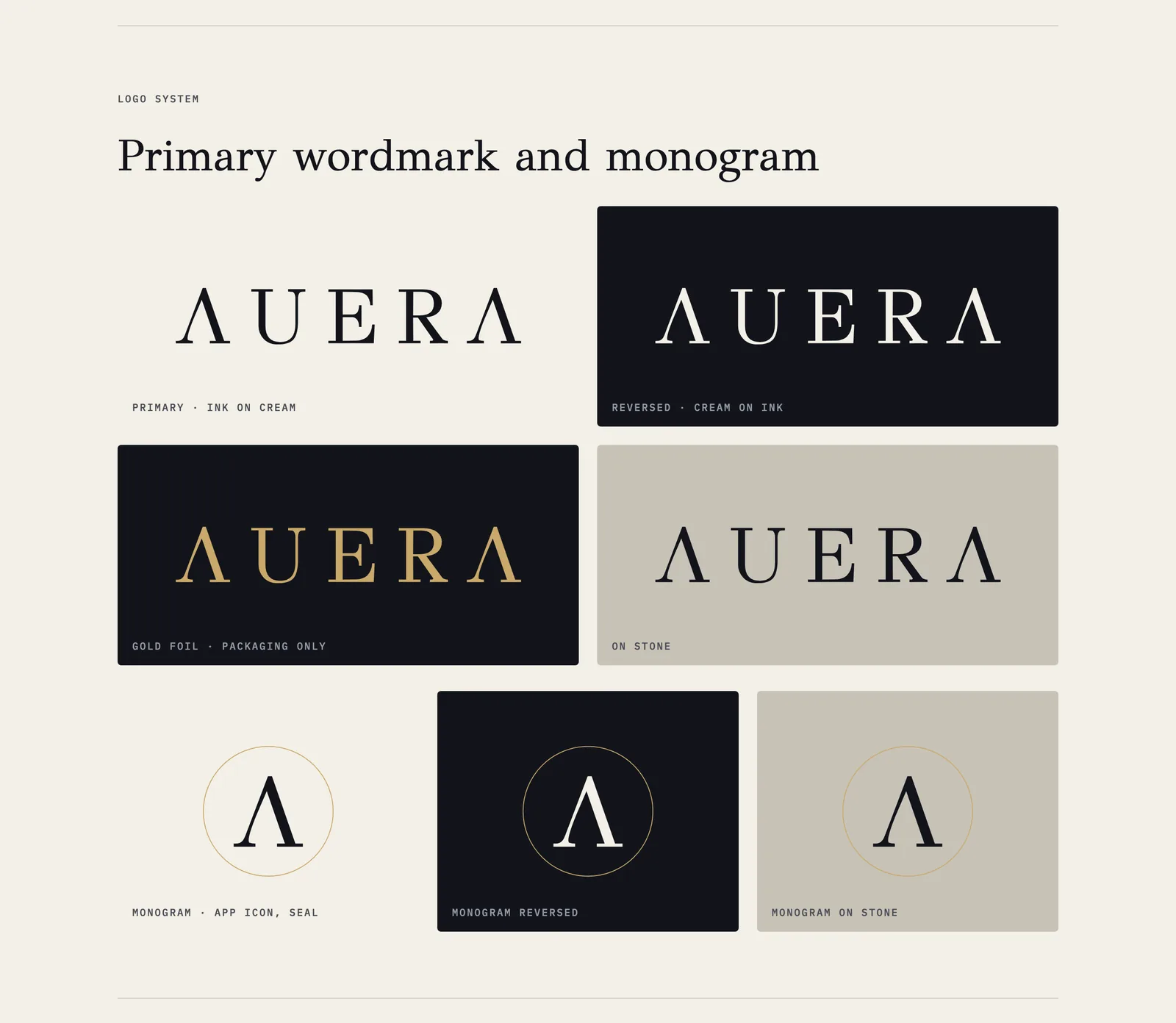
Primary wordmark and monogram in ink, cream, gold foil and stone.
A wordmark on its own is not enough for a skincare range. It has to work on a bottle, a seal, an app icon and a social avatar. So the system has a primary wordmark in ink on cream, a reversed version in cream on ink, a gold-foil version kept for packaging only, a version on stone, and a Λ monogram for the small places.
The board also sets the rules that keep it looking expensive. Clear space equals half the cap height on every side. The minimum size is 22 mm wide in print and 120 px on screen, and below that the monogram takes over. Nothing makes a premium mark look cheap faster than squeezing it into a corner.
I delivered the wordmark and monogram as SVG in three colourways, ink, cream and gold, together with the option sketches that led to them.
Cream paper and ink
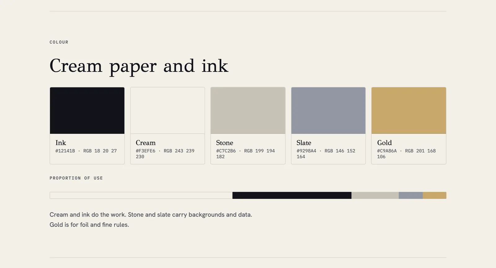
Ink, Cream, Stone, Slate and Gold, with the proportion of use.
The palette has five colours, and the board shows how much of each to use, not just what they are. Cream and ink do the work. Stone and slate carry backgrounds and data. Gold is for foil and fine rules.
A proportion bar is a small thing to add to a board, and it prevents the most common mistake with gold: using it everywhere until it stops meaning anything. If you only borrow one idea from this post, borrow that one.
Science, stated plainly
The voice is precise, calm and quietly confident. The board's rule is "Lead with the number, then the feeling", and its don't list is short: no miracle claims and no exclamation marks. The product facts on the board are the client's copy. The identity's job is to give them a calm place to sit, so they read as information rather than as a pitch.
Still lifes for the range
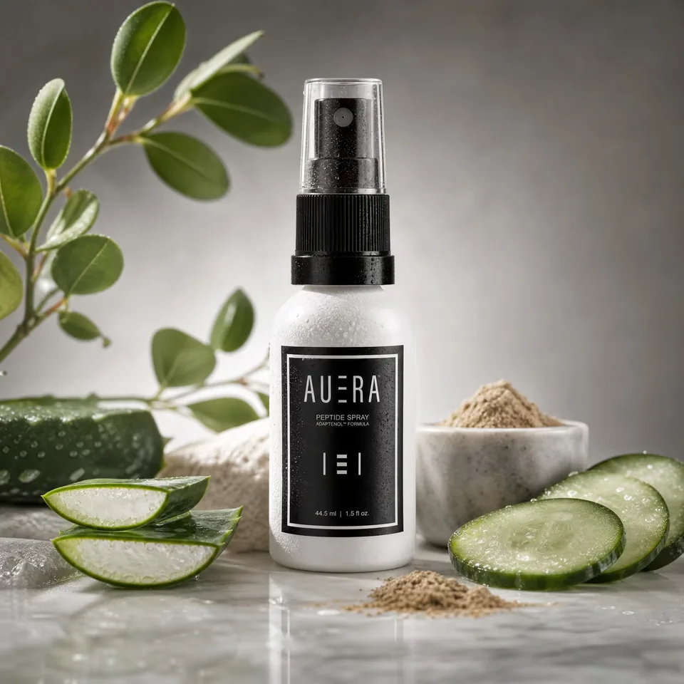
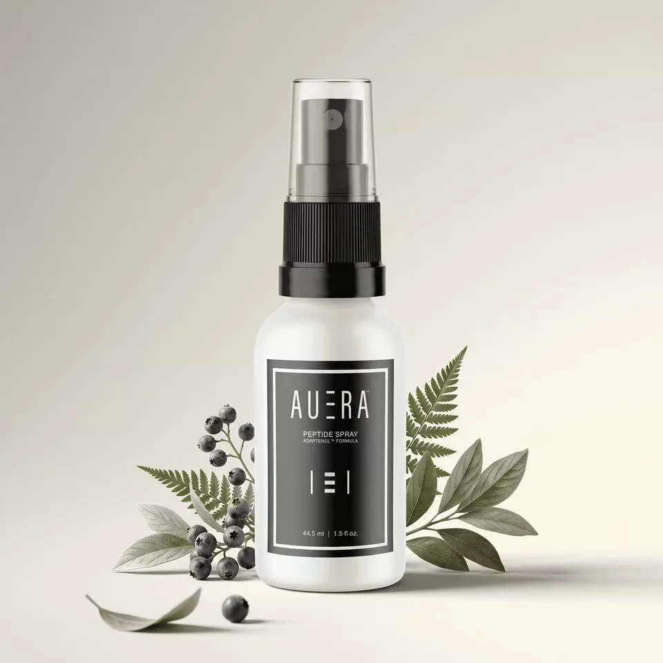
Still-life compositions for the peptide spray.
For marketing I made premium still-life compositions: the peptide spray on marble with aloe, cucumber and mineral powder, and again with fern, leaves and berries on cream. The props suggest what is inside without a single claim written on the picture. The bottles still carry the current label; the board notes that the new wordmark replaces that lockup on the next print run.
I also designed and built the live store at aueraskincare.com: a home page that moves from the signature spray to the science, the collection, the results and the ritual.
The full board is on the AUERA page.
liked it? share it.

