



to tell you a better story.
I prefer you visit my site on
the desktop.
Medicine that runs quietly: an identity for clinical software
Clinical software tends to look either sterile or loud: hospital white and blue, or a start-up gradient that promises to disrupt healthcare. MythicEMR is a platform for online clinics, from intake and video visits to prescriptions and pharmacy routing, and it needed to feel calm and trustworthy to the people who run those clinics. Its brand board opens with the line that sums it up: Medicine that runs quietly, like it always has.
The rod in the name
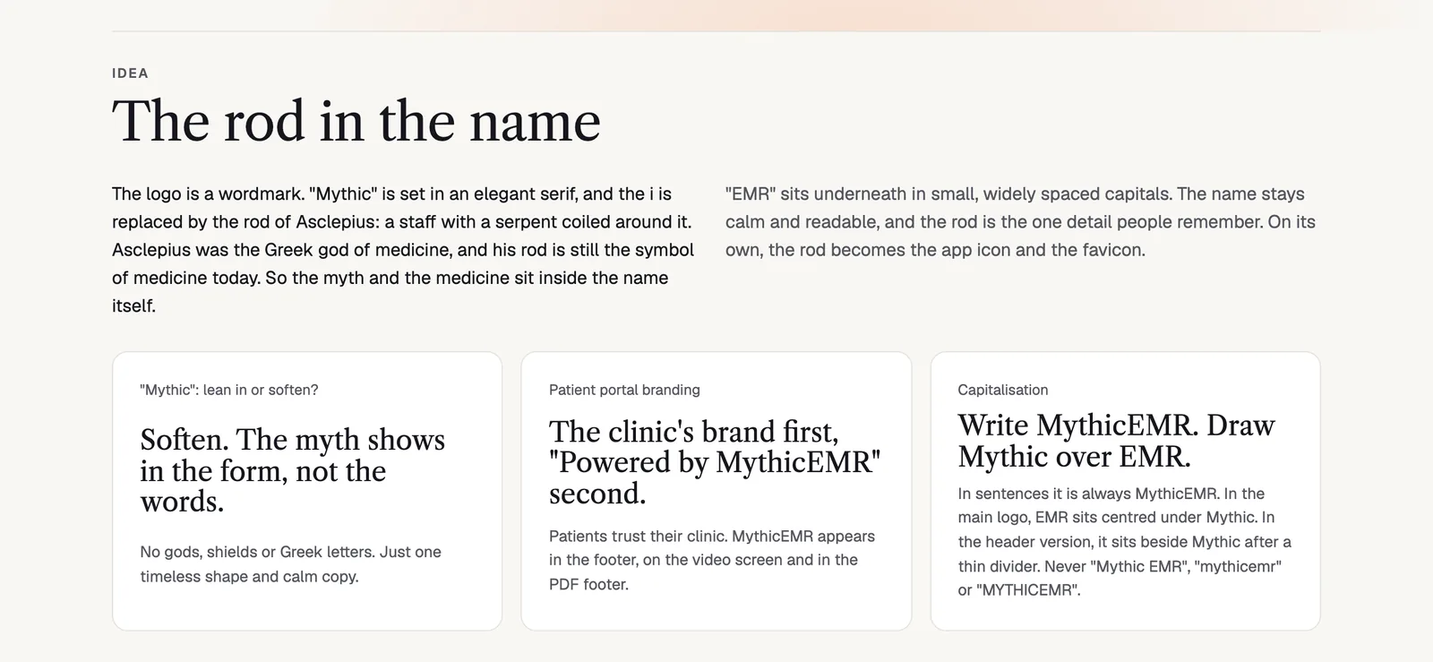
The idea: the rod of Asclepius stands in for the i.
The logo is a wordmark. Mythic is set in an elegant serif, and the i is replaced by the rod of Asclepius, a staff with a serpent coiled around it. Asclepius was the Greek god of medicine, and his rod is still the symbol of medicine today. So the myth and the medicine sit inside the name itself, and on its own the rod becomes the app icon and the favicon.
The board asks one question out loud: with a name like Mythic, do you lean in or soften? The answer was to soften. The myth shows in the form, not in the words. No gods, no shields and no Greek letters, just one timeless shape and calm copy.
Details that keep a symbol readable
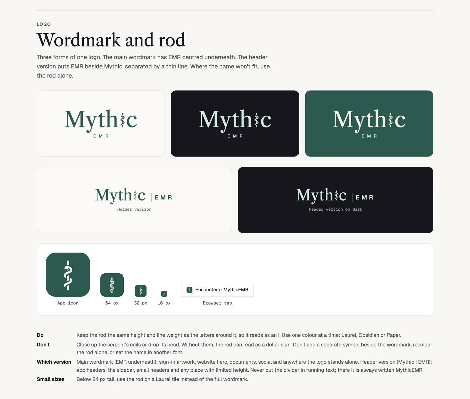
Wordmark and rod on Paper, Obsidian and Laurel, with the header versions and app icons.
The rule I like most on this board is a practical one: keep the serpent's coils open and its head on. Without them, the rod can read as a dollar sign, which is the last thing a clinic platform wants in its logo. The rod also keeps the same height and line weight as the letters around it, so it reads as an i first and a symbol second.
There are three forms of one logo: the main wordmark with EMR centred underneath, a header version with EMR beside Mythic after a thin divider, and the rod alone on a Laurel tile below 24 px. In a sentence it is always written MythicEMR, never with a space.
Because patients trust their clinic, not their clinic's software, the patient portal puts the clinic's brand first and "Powered by MythicEMR" second: in the footer, on the video screen and in the PDF footer. Knowing when to step back is part of an identity too.
One strong colour, soft aura
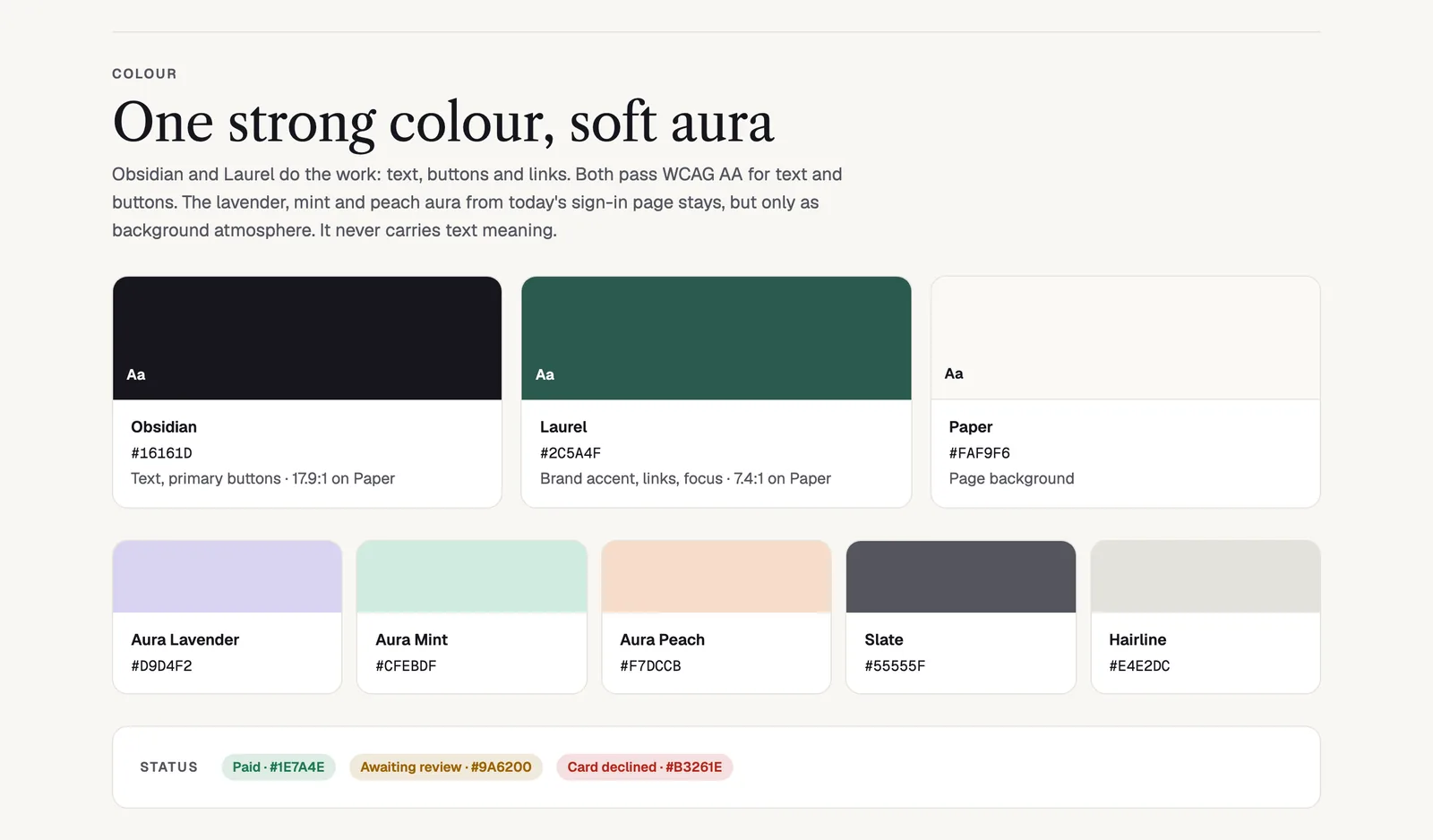
Obsidian and Laurel do the work; the lavender, mint and peach aura is atmosphere only.
Obsidian and Laurel do the work: text, buttons and links. Both pass WCAG AA for text and buttons on the Paper background. The soft lavender, mint and peach aura stays, but only as background atmosphere. It never carries meaning, so no status, warning or label depends on it. Status has colours of its own for paid, awaiting review and declined.
This split is worth copying. A brand can be soft and still accessible, as long as the soft colours are never asked to do a hard job.
A serif for moments, a sans for work
Libre Caslon is for moments: the wordmark, the sign-in page and headings. Geist runs the interface and matches the app. Geist Mono handles counts, IDs, amounts and the API docs. A clinic admin sees a calm serif when they arrive and a clear sans while they work.
A voice like a good front desk
The voice rule is one of my favourites to quote: talk to clinics like a capable colleague, and to patients like a good front desk. Use short sentences, say what happened, and say what to do next. "Your card was declined: insufficient funds. Try another card or contact your bank." is in. "Oops! Something went wrong." and "Unlock mythical healthcare superpowers today!" are out.
It is a small thing to write down, and it changes every error message, every email and every empty state in the product.
Carried into motion and the site
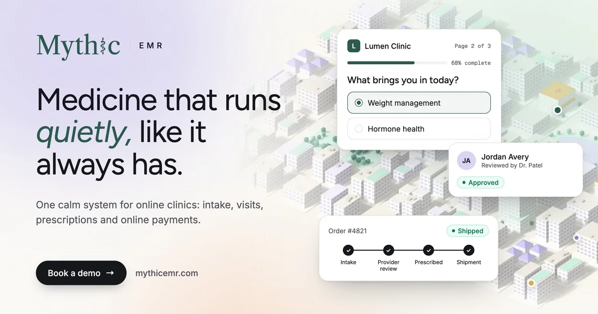
The social card for mythicemr.com.
From the board, the identity went on to an animated icon, a self-drawing wordmark, an email signature, profile loops and a 9-second logo sting. It also became the marketing site at mythicemr.com, built in Next.js 15 with GSAP, Motion and Rive, where the same aura turns into calm aurora gradients behind the product.
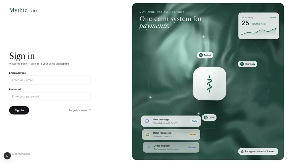
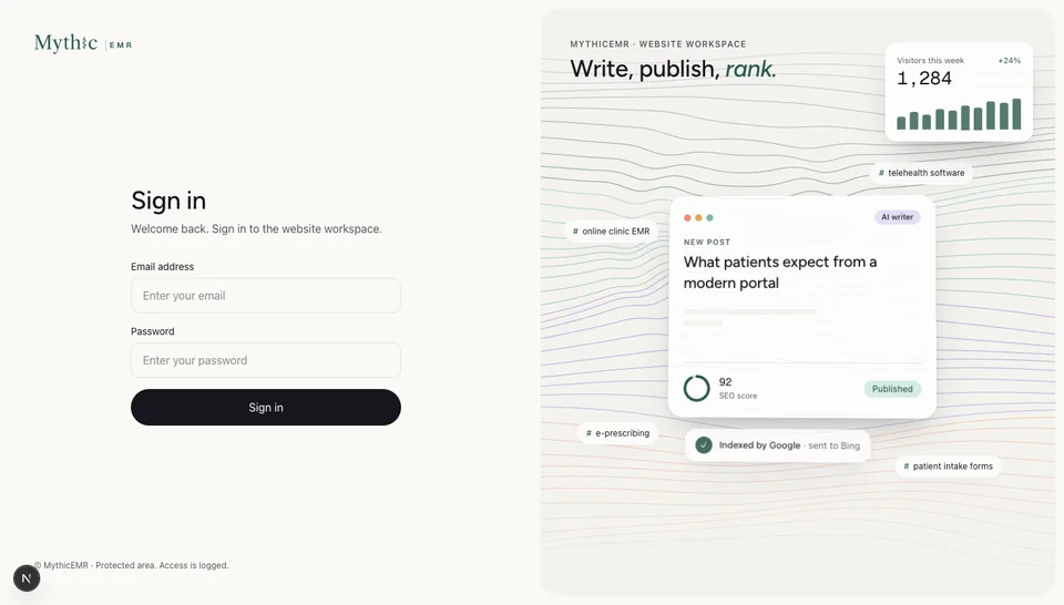
Sign-in screens for the clinic and website workspaces.
Quiet is harder to design than loud, because there is less to hide behind. Every rule on this board is there to stop something from getting louder than it needs to be.
The full board is on the MythicEMR page.
liked it? share it.

