



to tell you a better story.
I prefer you visit my site on
the desktop.
49 templates, one brand: building an ad library you can test
A new product has one problem that no amount of polish can fix: nobody knows yet which message will work. Adapt X.1 is a melatonin-free sleep spray, and the brief was to look like one calm brand at 3 a.m. while giving the ads enough variety to test messages across Meta and Google feeds. One beautiful hero ad would not do that. A library would.
This is how the library is put together, and what I would keep if I built another one tomorrow.
Start from questions, not layouts
The layouts fall into families, and each family answers one question a buyer has in the half second they look at a feed:
- Callouts point at the bottle and name what is in it. What is this?
- Social proof layouts carry a review or a quote. Does it work for people like me?
- Comparisons set a spray against pills and gummies. Why this and not what I already have?
- Offers lead with the trial and the guarantee. What does it cost me to try?
- Education layouts explain the formula in steps, numbers or ingredients. How does it work?
- Big ideas are posters: one line, one picture, the brand at full volume. Why should I care?
None of these patterns are new. Direct-response ads have used callouts, reviews and side-by-side comparisons for decades, because they answer real questions. The design work is making 49 of them feel like one brand.
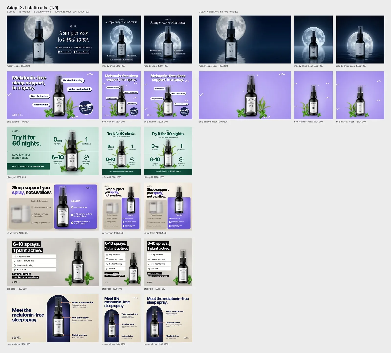
Part of the library: the same layouts in square, landscape and portrait.
One brand, many volumes
Some layouts follow the brand board to the letter: the moonlit layout, with its Midnight ground, Moonlight accent and thin type, is the brand speaking at its normal volume. Others borrow a louder look, a retro headline on orange or a warning label, because a feed rewards contrast and a calm brand still has to be noticed.
What stays the same across all of them is the product and the wordmark. The bottle is always the same black 30 ml bottle with its white label, and the name appears on every ad, small and in the same thin type. That is enough for a loud ad and a quiet ad to read as the same company.
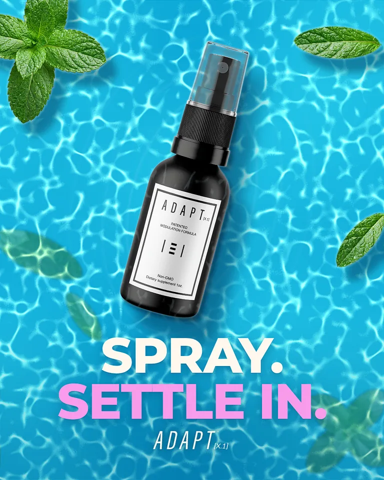
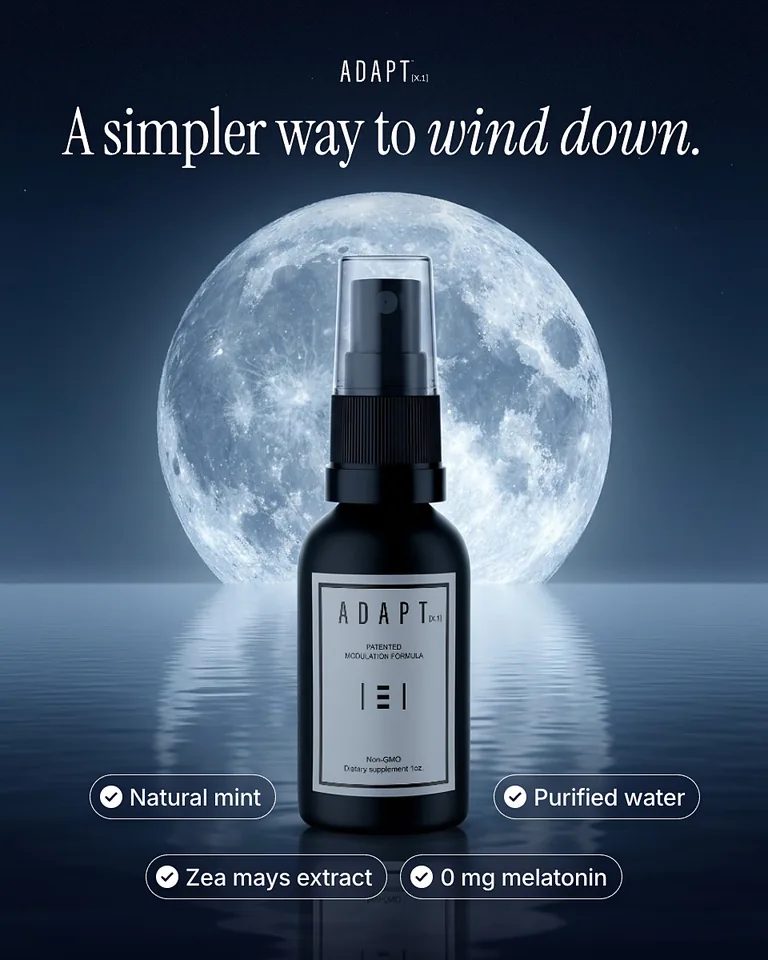
Two ends of the range: a bright tagline poster, and the moonlit layout that follows the board most closely.
Three sizes, built once
Every template exists in the three feed sizes that matter: 1:1 at 1200 x 1200, 1.91:1 at 1200 x 628 and 4:5 at 960 x 1200. That comes to about 147 finished ads.
A size is not a crop. In a 1.91:1 frame the bottle moves to one side and the copy gets a column of its own, while the 4:5 version stacks them. If you crop a square ad into a landscape slot, you lose either the headline or the product, and the platform will happily show it anyway.
Each size of each ad is built as its own HTML page. The photograph sits underneath as a plate, with the product, the props and the light, and the copy is set on top as real text. Two useful things follow. Changing a headline is a text edit rather than a retouch. And 30 of the templates also have a clean version with no copy at all, ready for whatever line comes next.
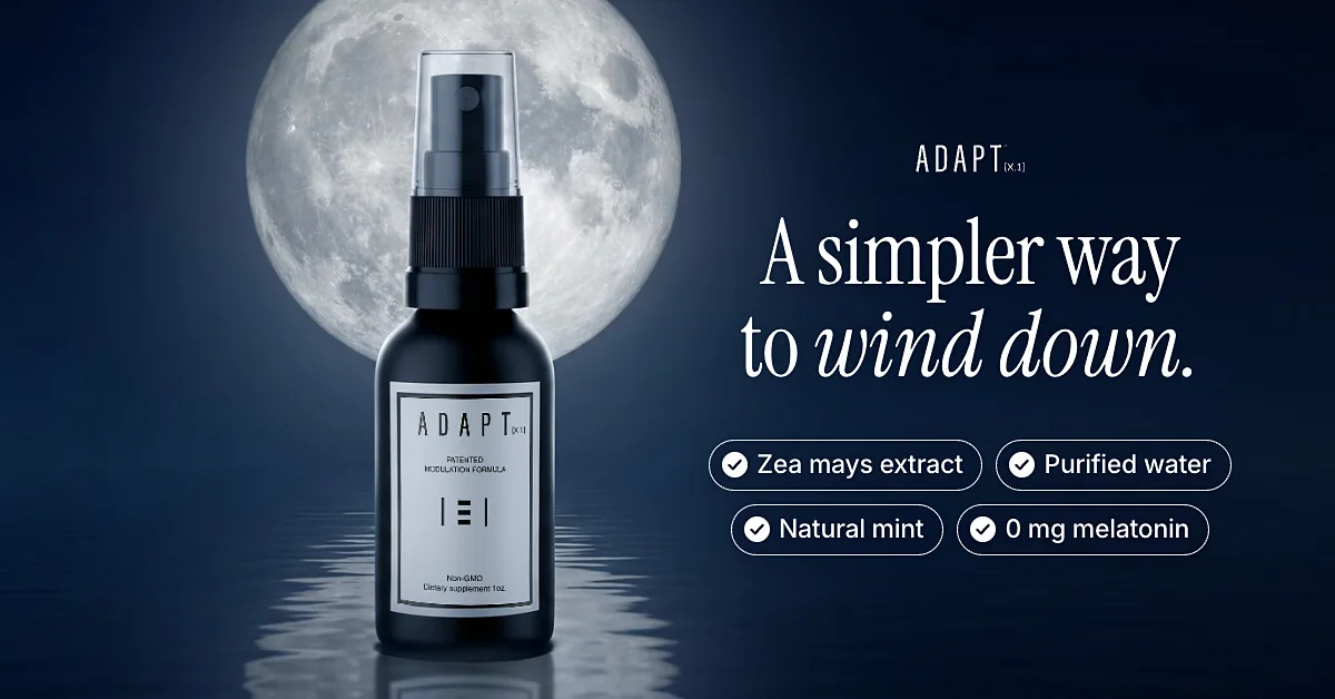
The moonlit layout at 1.91:1: the bottle moves aside and the copy gets its own column.
A master the team can edit
Exported images are the end of a pipeline, and a marketing team needs a beginning. So I wrote a small Figma plugin that imports the whole system as editable frames. Each ad becomes a frame with its background picture locked, and on top of it real text layers, shapes and vector icons. The 49 templates arrive as sections, each holding its three sizes and, where there is one, its clean version.
The point is ownership. Whoever writes next month's test can change a line in Figma and export it, instead of waiting for a designer to open a source file.
Test messages, not decorations
A library is only useful if the tests it makes possible are worth running. These are the rules I would hand to anyone running it:
- Change one thing at a time. Compare two layouts with the same headline, or two headlines in the same layout. If both change, you learn nothing.
- Test families before details. Find out whether reviews beat offers before you test the colour of a badge.
- Keep the brand fixed. If an ad only wins because it looks like somebody else, it has not really won.
- Retire layouts. A library grows. The layouts that never earn their place should leave it.
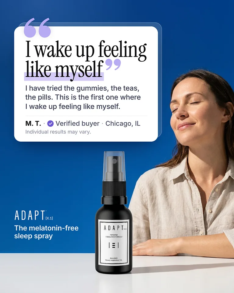
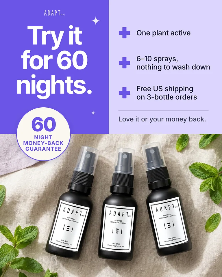
Same product, two different questions: a review layout and an offer layout. The quote and the guarantee are the client's own copy.
If you are starting one
Start with ten templates, not fifty, and make sure each one answers a different question. Build them so that copy is text and sizes are layouts, not crops. Put the master somewhere the team can edit it. Then let the results decide which layouts deserve more versions.
The brand board, the product photography and more of the ads are on the Adapt X.1 page, and every ad I have made sits together on the all-ads wall.
liked it? share it.

