



to tell you a better story.
I prefer you visit my site on
the desktop.
Designing a calm brand for a sleep product
Most supplement brands shout. Big claims, bright colours, exclamation marks. That can work on a shelf in daylight. It does not work for someone holding a phone in bed at a quarter past three, which is exactly when a sleep product is needed most.
Adapt X.1 is a melatonin-free sleep spray, and its brand starts from that hour. The board says it in one line: Sleep, simplified. A calm brand for the hardest hour of the night.
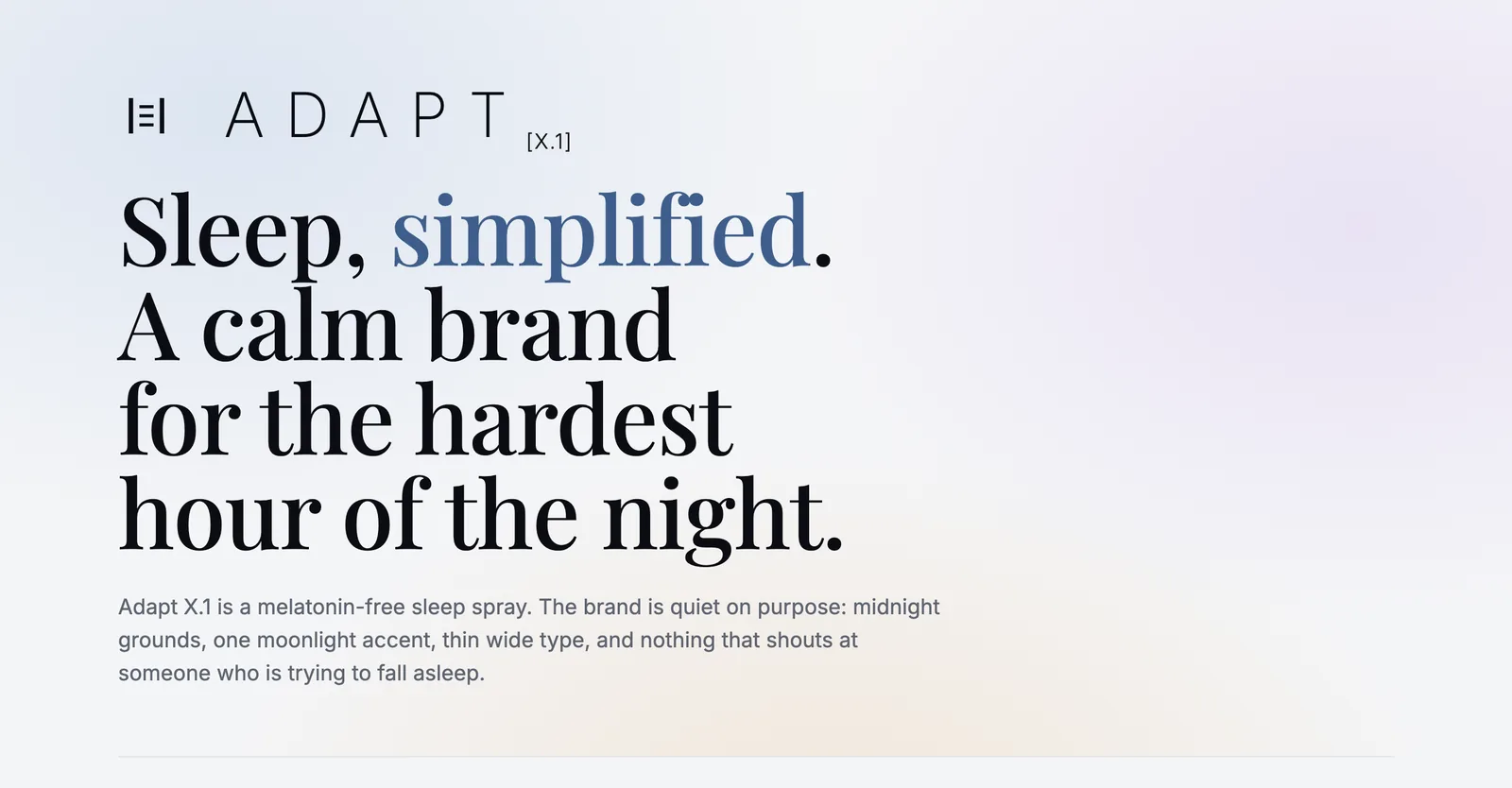
The opening of the brand board.
Design for the moment of use
The idea on the board is called the quiet hour. The brand lives at 3:16 AM, and every choice is something you could look at in the dark without waking up more: low-contrast grounds, light type weights, slow motion.
It is a useful question for any brand. When does the customer meet you, and what state are they in? For a sleep product the answer is tired, a little anxious and lit by a screen. Everything else follows from that answer, including what to leave out.
Midnight, with one light on
The palette has six colours, and each one has a job. Midnight is the ground. Deep Navy gives depth. Moonlight is the only accent. Label White is for the label, Slate for quieter text, and Dawn appears only in morning moments.
The rule that matters most is the shortest one: a single accent. When a brand allows two or three accent colours, every layout starts to argue with itself. With one, the eye knows where to go even when it is half closed.
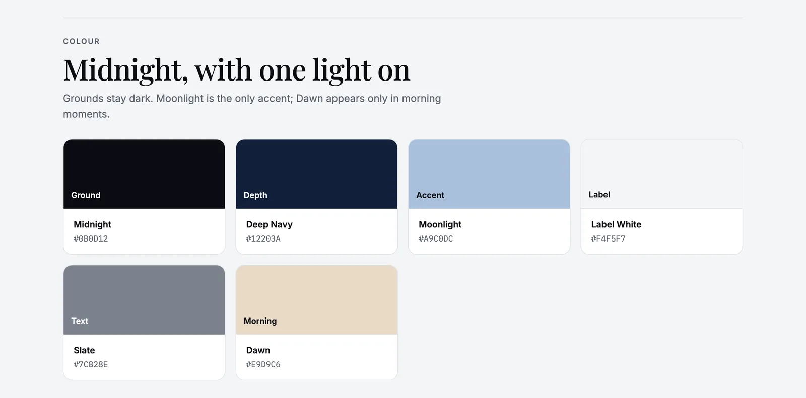
Six colours with roles. Dawn is kept for the morning.
Thin type, wide spacing
The wordmark is ADAPT in Inter Extra Light with wide tracking, and the version tag [X.1] sits low beside it. Playfair Display carries the editorial lines, Inter at 200 to 400 does the everyday work, and IBM Plex Mono sets label copy and numbers.
The label glyph is the formula in one mark: two steady walls with three even lines between them, a rhythm settling down. It works at 16 px and on a 30 ml bottle, and below 24 px the board asks for the glyph on a Midnight tile instead of the full name.
The board is just as clear about what the mark must never do: be set in bold, gain a moon or stars, or sit on a bright ground. The moon belongs to the photography, not to the logo. Writing the don'ts down early saves a lot of polite arguments later.
A voice that does not wake you up
The voice is soft, plain and unhurried. Lines like "Still awake? That's okay." and "Lights low. Phone down. We'll be here tomorrow." are in. "KNOCK OUT INSTANTLY!!" and "Guaranteed 8 hours, every night." are out.
The don't list is the most honest part of any brand board. It names the shortcuts a category is tempted by, and closes them before the first ad is written. In supplements those shortcuts are loud promises, and a calm brand gives them up on purpose.
Eight ways to photograph a quiet bottle
A small black bottle does not give a photographer much to work with, so I made a concept board of eight photo directions: Klein Blue Long Shadow, Lavender Eclipse, Moonrise Eclipse, Still Water Rings, Moon Halo Portrait, Monument in the Corn Grass, Cobalt Morning and Liquid Crescent Moon. Each one tries a different way to say night without simply saying dark.
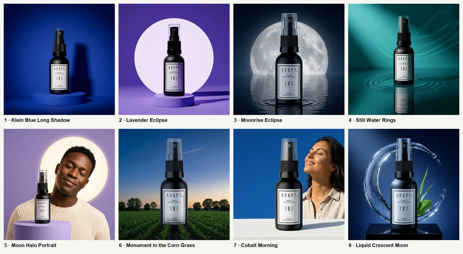
The art-direction board: eight photo concepts for the same bottle.
Alongside them I made product compositions, such as the moonrise pedestal and the pastel arch, that the ads can draw on.
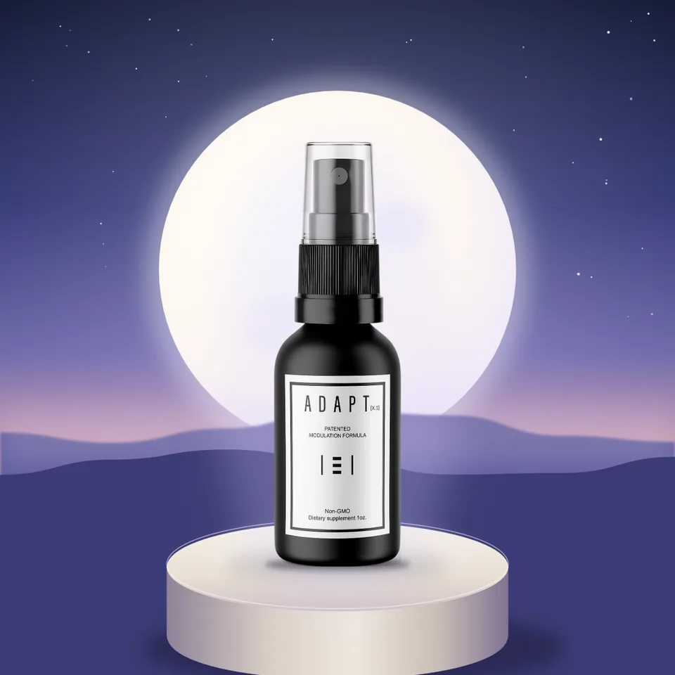
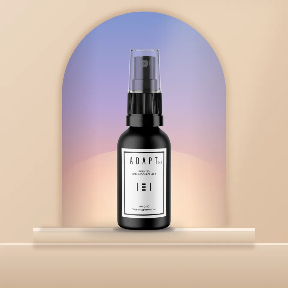
Product compositions: moonrise and arch.
Where it meets the night
A brand board is not finished until it shows the brand in use. For Adapt X.1 that meant the store hero, a lock-screen notification at 11:47 PM, the order email and the label itself. The notification is my favourite: "Still awake? Lights low, phone down." It is the brand doing its job in the exact place it will be seen. The order email has a similar touch: keep it on the nightstand, not in the bathroom.
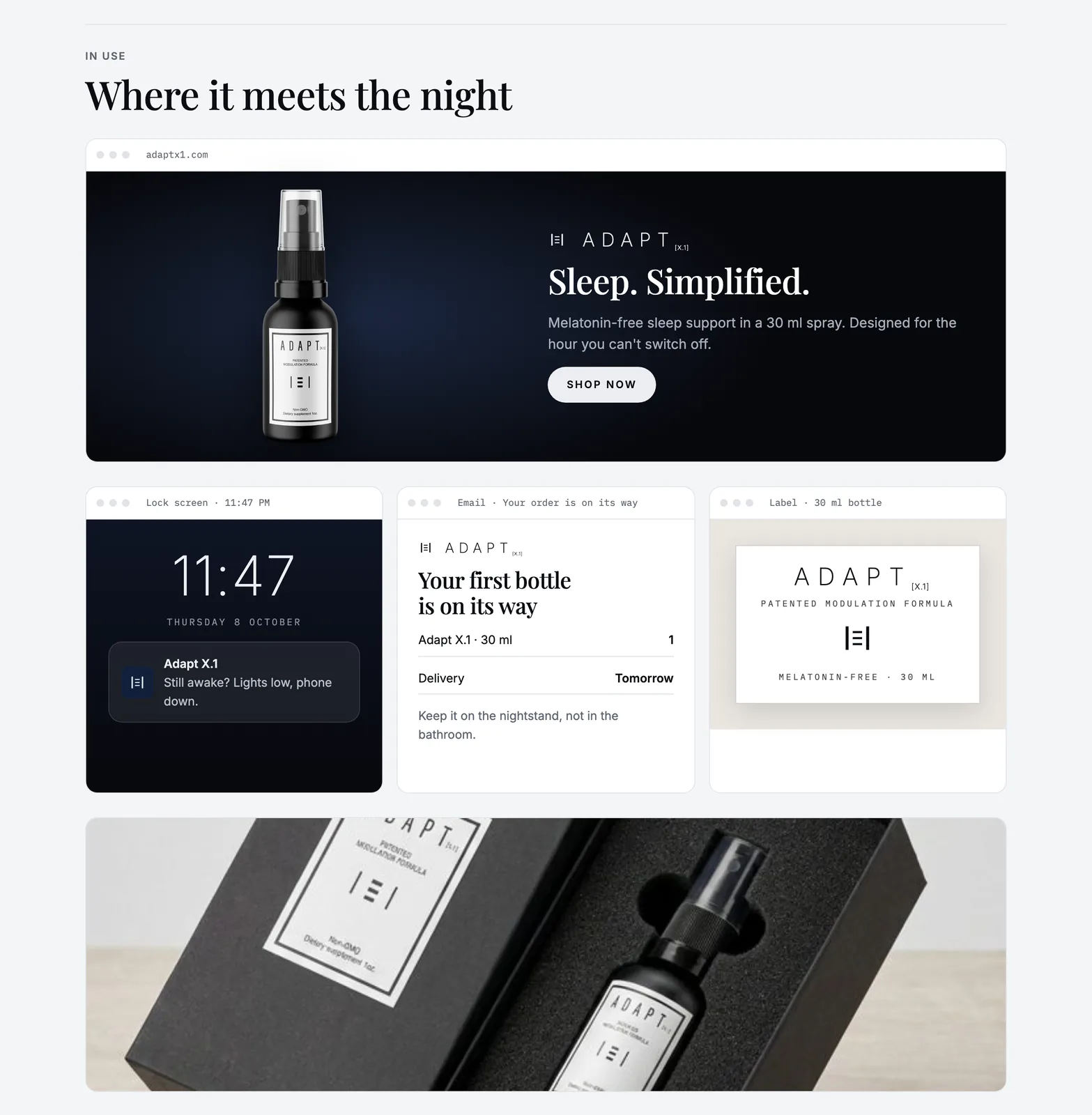
In use: store hero, lock screen, order email and label.
The same thinking carried into the live store at adaptx1.com, a long dark home page that moves from the product to the science, the label, the ritual and the questions. It also carried into vertical motion ads, including a narrated sleep story that runs on motion.wathek.dev.
If you are designing for a product that is used at a particular moment, design for the moment. Calm is not a style you add at the end. It is a set of rules about what you leave out, written down before anyone starts.
More of the board and the ads are on the Adapt X.1 page.
liked it? share it.

