



to tell you a better story.
I prefer you visit my site on
the desktop.
One page, every surface: how a brand board keeps a brand consistent
Adapt X.1, CloudifyTechs, MythicEMR, AUERA and X Tracker each have a brand board. Not a hundred-page guideline that nobody opens, and not a moodboard of things I like, but one long page that answers the questions a designer, a developer or a marketer will ask the day after it is handed over.
The boards follow the same structure, and the structure is the point. Here it is, section by section.
1. One idea, in a sentence
Each board opens with a promise short enough to repeat in a meeting. Adapt X.1: a calm brand for the hardest hour of the night. CloudifyTechs: automation that feels like magic, and shows every step. MythicEMR: medicine that runs quietly, like it always has.
When a later decision is hard to call, the idea settles it. Should the sleep brand's bedtime notification say "Don't miss out"? Read the sentence again.
2. The logo at every size it will live at
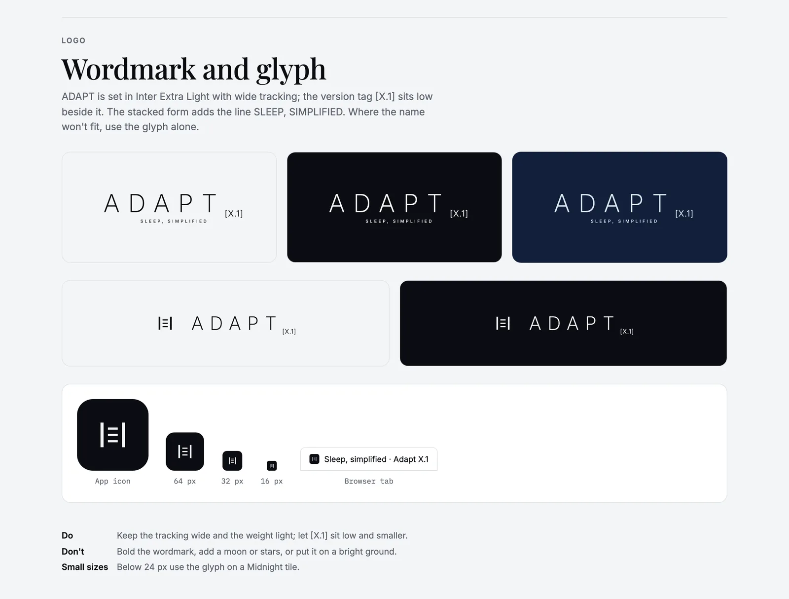
Adapt X.1: the wordmark on each ground, and the glyph from app icon to 16 px.
A logo section that only shows the hero version is half finished. The Adapt X.1, CloudifyTechs and MythicEMR boards each show the wordmark on every ground it will meet, then the app icon at 64, 32 and 16 px, and a browser tab. Under that sit three short lines: a do, a don't and a small-size rule.
The small-size rules are the ones people need most and find least. Adapt X.1: below 24 px, use the glyph on a Midnight tile. CloudifyTechs: below 24 px, use the hat on a Spell Blue tile and drop the stars. MythicEMR: below 24 px tall, the rod on a Laurel tile. Sooner or later somebody will put your logo into a 16 px favicon, and they should not have to guess.
3. Colours with jobs
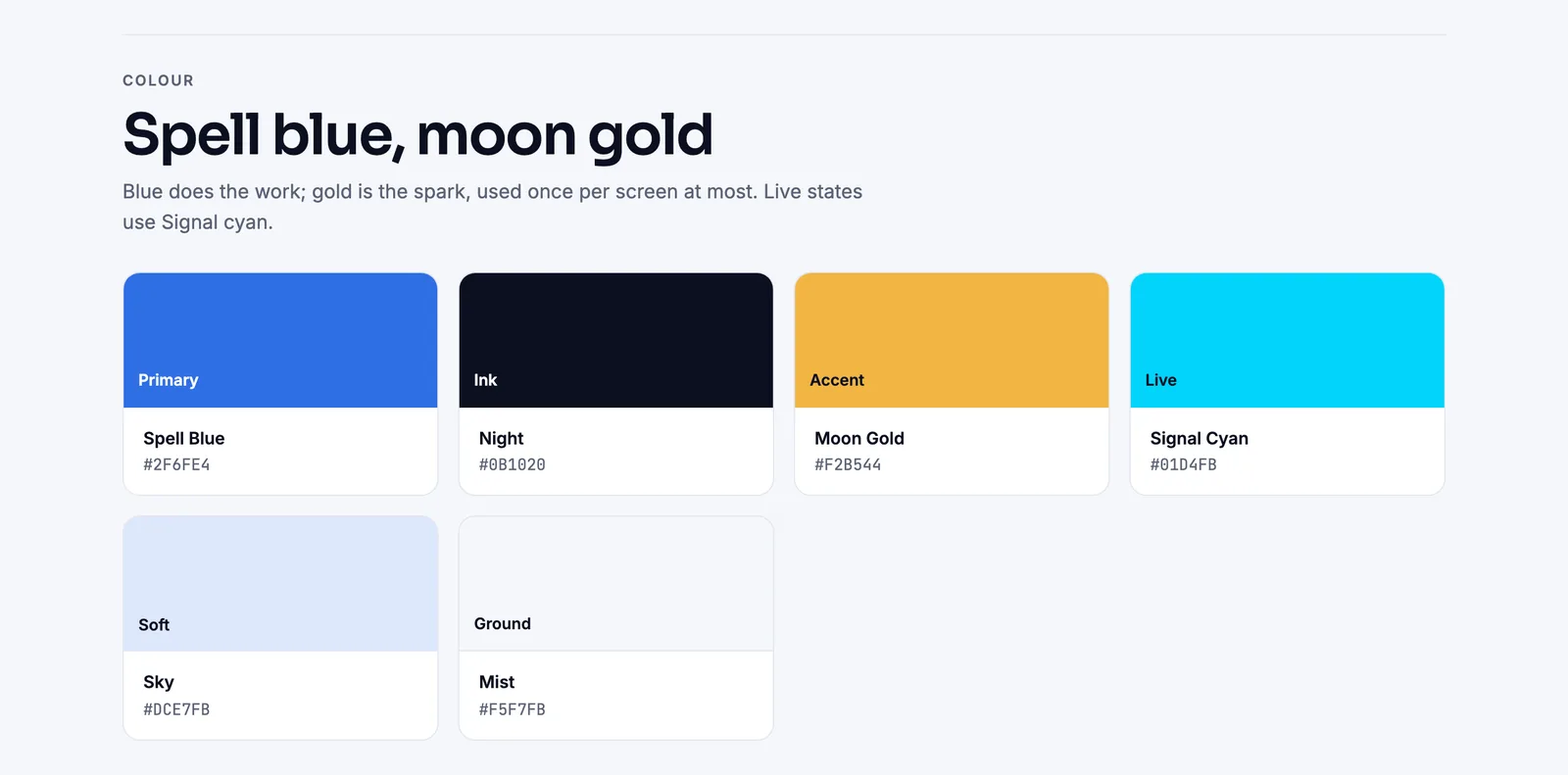
CloudifyTechs: Spell Blue does the work, Moon Gold is the spark.
A palette without roles is only a suggestion. Every colour on these boards has a job, such as ground, depth, accent, text or live state, and the important rules are written as limits:
- CloudifyTechs: Moon Gold is used once per screen at most.
- Adapt X.1: Moonlight is the only accent, and Dawn appears only in morning moments.
- X Tracker: yellow is the only action colour; teal and orange are reserved for data.
- AUERA: gold is for foil and fine rules.
- MythicEMR: the soft aura is atmosphere and never carries meaning.
Limits are what make a palette recognisable. Without them, every new screen adds one more colour and the brand slowly turns into everyone else's.
4. Type with roles
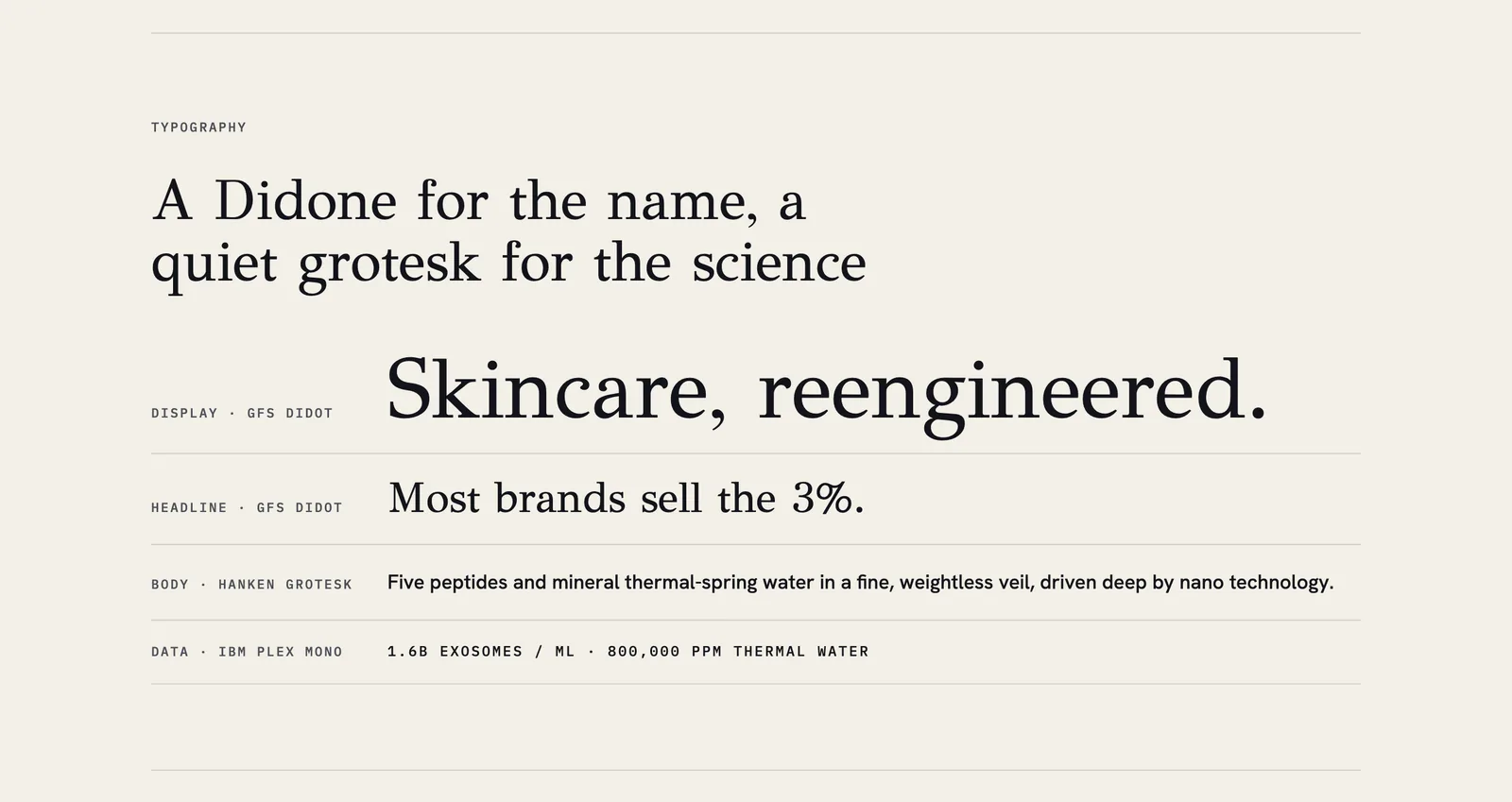
AUERA: a Didone for the name, a quiet grotesk for the science, a mono for data.
Most of the boards use three typefaces, and each one has a single job: a display face for moments, a working sans for the interface and body copy, and a mono for labels, numbers and code. Playfair Display, Inter and IBM Plex Mono for Adapt X.1. Sora, Inter and JetBrains Mono for CloudifyTechs. Libre Caslon, Geist and Geist Mono for MythicEMR. GFS Didot, Hanken Grotesk and IBM Plex Mono for AUERA.
The specimens use real lines from the product rather than placeholder text, so you can judge a pairing at the sizes it will actually be used.
5. A voice with do and don't lines
Tone of voice is the section that changes the most work and gets the least attention. I write it as pairs: lines we say, and lines we don't. "Still awake? That's okay." against "KNOCK OUT INSTANTLY!!" "Video settings saved." against "Woohoo! Your settings are legendary!"
A writer can apply a pair in seconds. A list of adjectives like friendly, bold and human applies to every brand on earth, so it helps nobody decide anything.
6. The brand in use
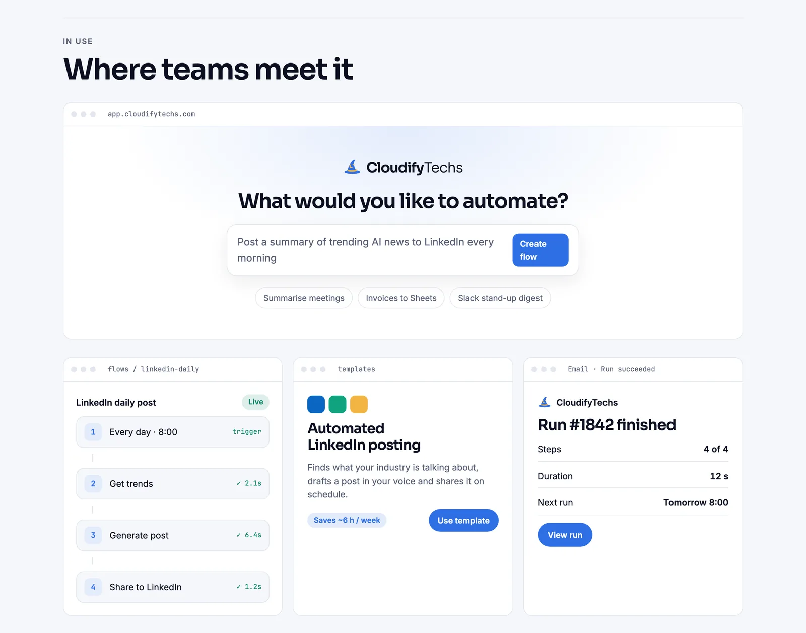
CloudifyTechs in use: the flow prompt, a flow, a template card and a run summary.
The last section shows the brand where people will meet it: a store hero, a lock-screen notification, a sign-in page, an email, an invoice, a label. This is where a board proves itself. If the rules above cannot produce a believable email header, they are not finished yet.
7. A checklist
The Adapt X.1, CloudifyTechs and MythicEMR boards end with a short checklist of what they cover: the wordmark and its small sizes, colours with roles, the typefaces, the voice and the touchpoints. It sounds like admin. It is how the next person knows what already exists and what they still need to ask for.
Why one page
A single scrolling page can be opened by anyone, linked from a ticket and read in five minutes. I build mine in HTML, which means the colours and type on the board are the real ones rather than a picture of them, and updating the board is as easy as updating a web page.
You can see each board in full in the Designing section.
liked it? share it.

