



to tell you a better story.
I prefer you visit my site on
the desktop.
What makes an on-site campaign convert
From 2018 to 2022 I worked at an on-site personalisation platform: I started on its CRO team and later led its development team. The clients were airline and retail brands, and the job was always the same: turn an idea into a campaign that runs on their live site, then prove with a test that it is worth keeping.
Along the way I designed more ready-made campaign features than I can count. A few of them are rebuilt below as mock-ups with invented stores. The details changed from client to client. The principles did not.
1. Social proof has to be true
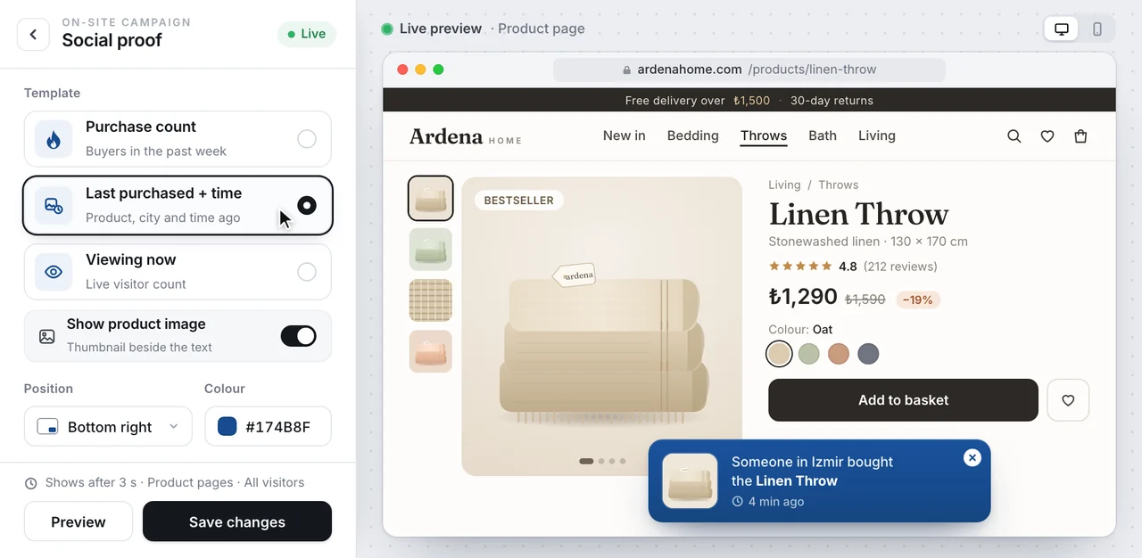
Mock-up with an invented store: the social-proof builder and its live preview.
A social-proof message tells you that other people are buying, or looking at, the thing you are looking at. The templates I designed cover the three versions that matter: a purchase count, the last purchase with its time, and how many people are viewing now, each with an optional product image.
Two rules make it work. First, the numbers have to be real. A counter that makes things up is a lie with a nice font, and once a shopper catches one, they stop believing the rest of the page. Second, timing. In the mock-up the message waits three seconds and only appears on product pages, so it arrives once the visitor has started to look, not while the page is still loading.
2. Put the main action under the thumb
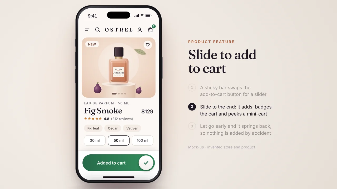
Mock-up with an invented store: slide to add to cart on a mobile product page.
Slide to add to cart swaps the sticky add-to-cart button on a mobile product page for a slider. Slide to the end and the item is added, the cart badge updates and a mini cart peeks up from the bottom. Let go halfway and the thumb springs back, so nothing is added by accident.
The lesson is not that sliders beat buttons. It is that the main action on a phone should sit where the thumb already rests, and that the moment of adding something should feel like the shopper did it, not the page.
3. A game is only as good as its reward
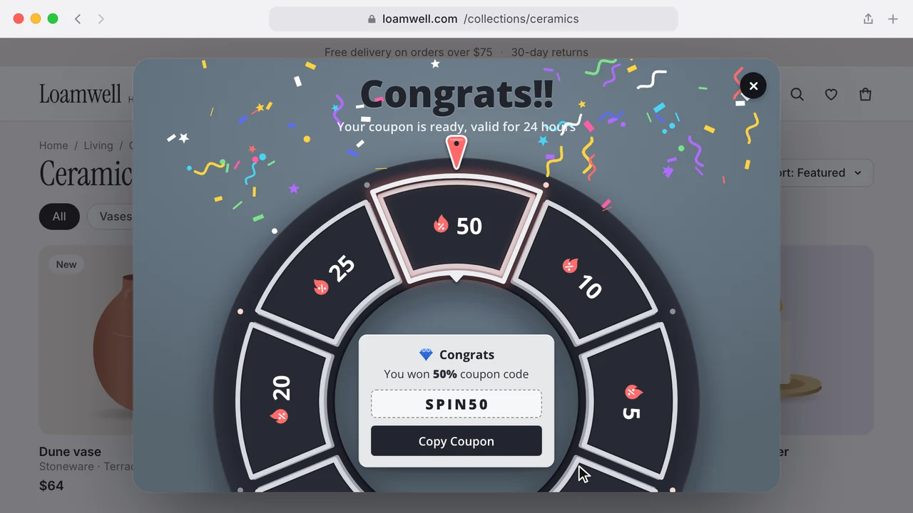
Mock-up with an invented store: spin to win, with the reveal and the copy-code step.
Spin to win is a coupon wheel. It is easy to make one noisy and much harder to make one useful. The part that does the work is not the wheel but what happens after it: a clear reveal of what you won, the code in a box, and one button to copy it. If people cannot find their code at checkout, the game has cost you a customer instead of winning one.
4. Ask once, at the right moment
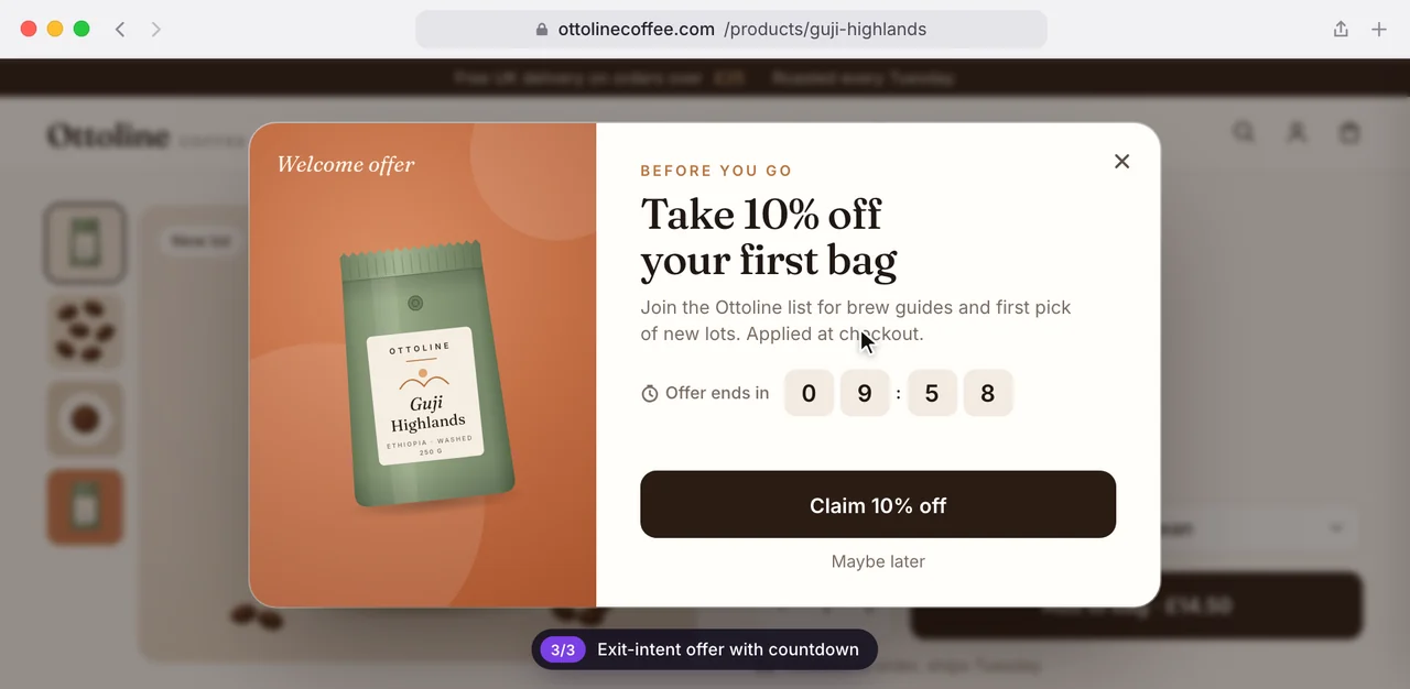
Mock-up with an invented store: an exit-intent offer with a countdown.
An exit-intent offer appears when a visitor is about to leave. It works best when it says one thing, gives one reason and offers one action, with an easy way out such as "Maybe later". A countdown is only honest when the offer really ends. The same goes for coupon banners: a top bar with a code you can copy and, only where it is true, a count of how many are left.
5. Help is a campaign too
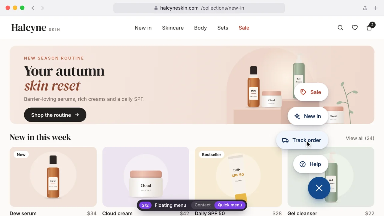
Mock-up with an invented store: a floating menu opening up to four options.
Not every campaign sells. A floating menu is a corner button that opens up to four contact options or a quick menu: track an order, ask for help, jump to the sale. Removing a reason to leave is worth as much as adding a reason to buy, and it is far less annoying.
Build templates, not one-offs
Every feature above was designed as a template with builder settings, so a marketer could change the template, the position, the colours and the text without asking a developer. That is the real product. A campaign that needs a developer every time gets run once. A template gets run, tested, changed and run again.
And test everything. A campaign that feels clever in a design review is still only an idea until an A/B test says it should stay. A design that loses its test should go, however much you liked drawing it.
If you are planning on-site campaigns of your own, start with the honest ones: real social proof, a clearer main action and help that is easy to find. They are the least exciting to design and the easiest to keep.
liked it? share it.

