



to tell you a better story.
I prefer you visit my site on
the desktop.
Giving an automation tool a voice with retro posters
Automation tools tend to market themselves the same way: a screenshot of a node graph, a gradient, a claim about saving hours. They all look alike, and very few of them are memorable. CloudifyTechs is my own automation brand, no-code flows and AI agents plus a studio that builds them for you, so I had the freedom to try something else.
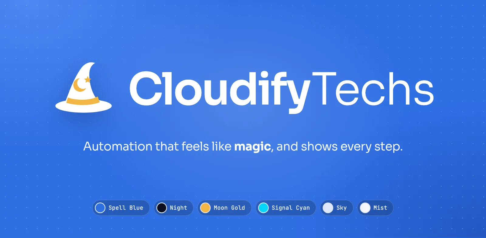
The wizard-hat mark and wordmark on Spell Blue.
Start with a feeling you can defend
The brand board opens with the promise: automation that feels like magic, and shows every step. The idea is the wizard's hat. Good automation feels like a spell: you describe what you want and it happens. The hat says that in one shape, and its gold band, moon and star keep it warm rather than robotic.
The second half of the promise matters as much as the first. Magic is the feeling, not the method. Every flow is shown step by step, every run is logged, and nothing happens off-screen. The board's phrase for it is "wonder you can audit". That is what gives the marketing permission to be playful: the product underneath is not.
A voice with limits
Voice guidelines are easiest to follow as pairs. The CloudifyTechs voice is clear, helpful and a little magical, and the board shows what that means in practice:
- "Your flow ran in 12 seconds. 4 steps, all done." rather than "Unleash limitless AI superpowers!"
- "Describe the task. We'll draft the flow." rather than "Revolutionary hyper-automation platform."
Colour follows the same idea of restraint. Spell Blue does the work, and Moon Gold is the spark, used once per screen at most. Sora carries the headlines, Inter runs the product and JetBrains Mono labels the steps, runs and code.
The posters
With the brand in place, I made a series of magazine-style ads in three looks: late 80s and early 2000s print, 90s editorial, and Japanese editorial. They were art-directed with AI image tools, and each one follows a few rules of its own. The cloud is the recurring hero. The line talks about freedom from busywork rather than listing features. And each poster sets the name the way a real magazine ad of its period would have.
That last rule is a deliberate exception. Inside the product, the wordmark is never set in another typeface. On a poster that imitates the late 80s, period lettering is part of the joke, and the joke only works if the rest of the brand is strict.
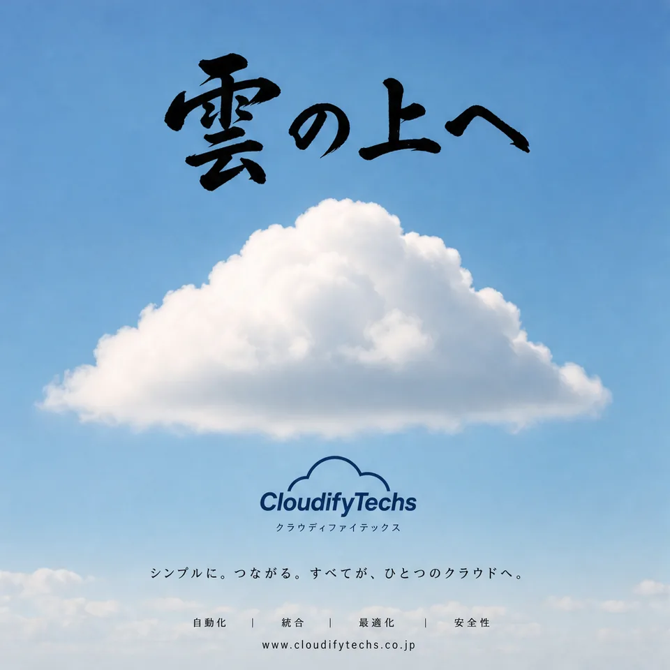
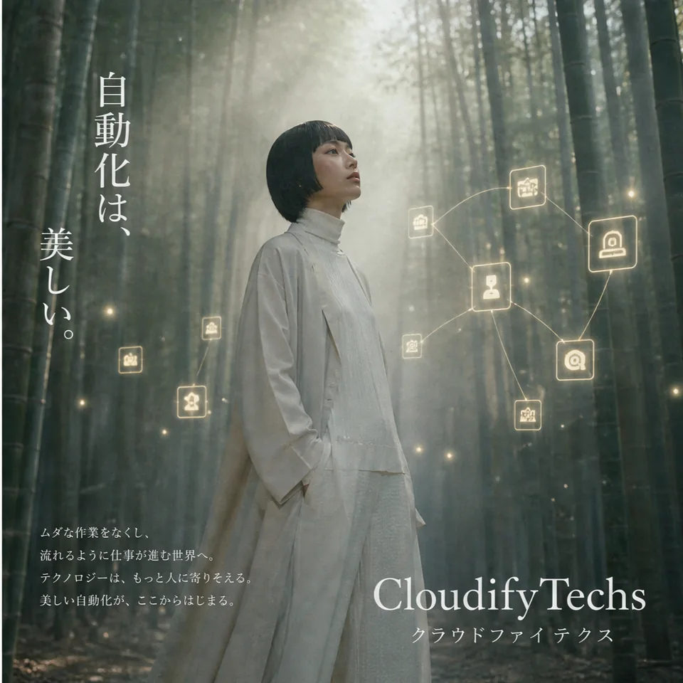
Japanese editorial: a cloud below a brush headline, and a bamboo forest with glowing workflow icons.
The Japanese set is the quietest. A single cloud under a brush headline says more about calm, reliable automation than a diagram could. The bamboo forest poster puts the workflow icons into the scene as small lights, which is about as close as the series comes to showing the product.
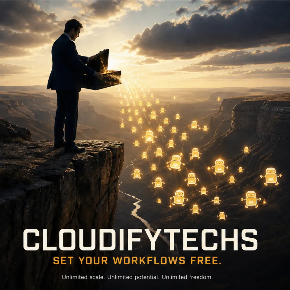

Late 80s print and 90s editorial: lanterns over a canyon, and The Automation Catalog.
The 80s and 90s sets are louder. Lanterns released over a canyon become "Set your workflows free". A whale breaching beside a sailor with a laptop becomes the cover of an automation catalogue. A little absurdity helps here: a tool that can smile at itself is easier to remember than one that only lists integrations.
What I left out
AI image tools are very good at reaching for famous references. Ask for an 80s sports poster and you can get something uncomfortably close to a real sports brand. Ask for a friendly mascot and you may get one that looks like a fast-food chain's. Several of the most striking images in this series never left my folder for exactly that reason: a famous slogan, a logo-like mark, a mascot that felt too familiar, a face that looked too much like someone real.
This is the part of AI art direction that does not get talked about enough. Generating is fast. Editing is the job: checking every corner of every image for somebody else's brand, somebody else's face or somebody else's line. If a poster only works because it borrows another company's fame, it is not your brand's poster.
Why posters at all
Posters will not explain a product, and they are not meant to. They give a small brand a look people recognise before they read the name, and they give the product screenshots something to stand next to. For an automation tool, being remembered is half the battle; the flows themselves can do the explaining once someone signs in.
The board and the posters are on the CloudifyTechs page, and the product lives at cloudifytechs.com.
liked it? share it.

